Designing digital experience, a practical course during 6-week long, instructed by Sketchin, one of the biggest and most rapidly expanding design studios in Europe, we engaged in a complete design app process. Our journey began with problem identification, followed by solution design, and culminated in user testing. With an initial brief and a defined persona in mind, with Rita Moreira and Antonella Pastore we were tasked with creating an interactive prototype that would cater to our persona's needs.
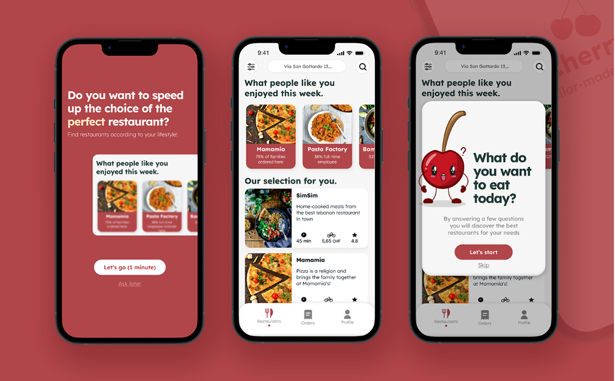
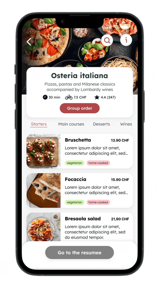
Cherry is a food delivery app that was designed as part of a digital experience design course at the university. The app was created with the aim of meeting the needs of users by providing them with a hassle-free and straightforward method of ordering food from their preferred restaurants. Cherry offers a wide range of features such as the ability to browse through a variety of home-cooked food options, place group orders, and track delivery status, all through a single platform.
The Persona
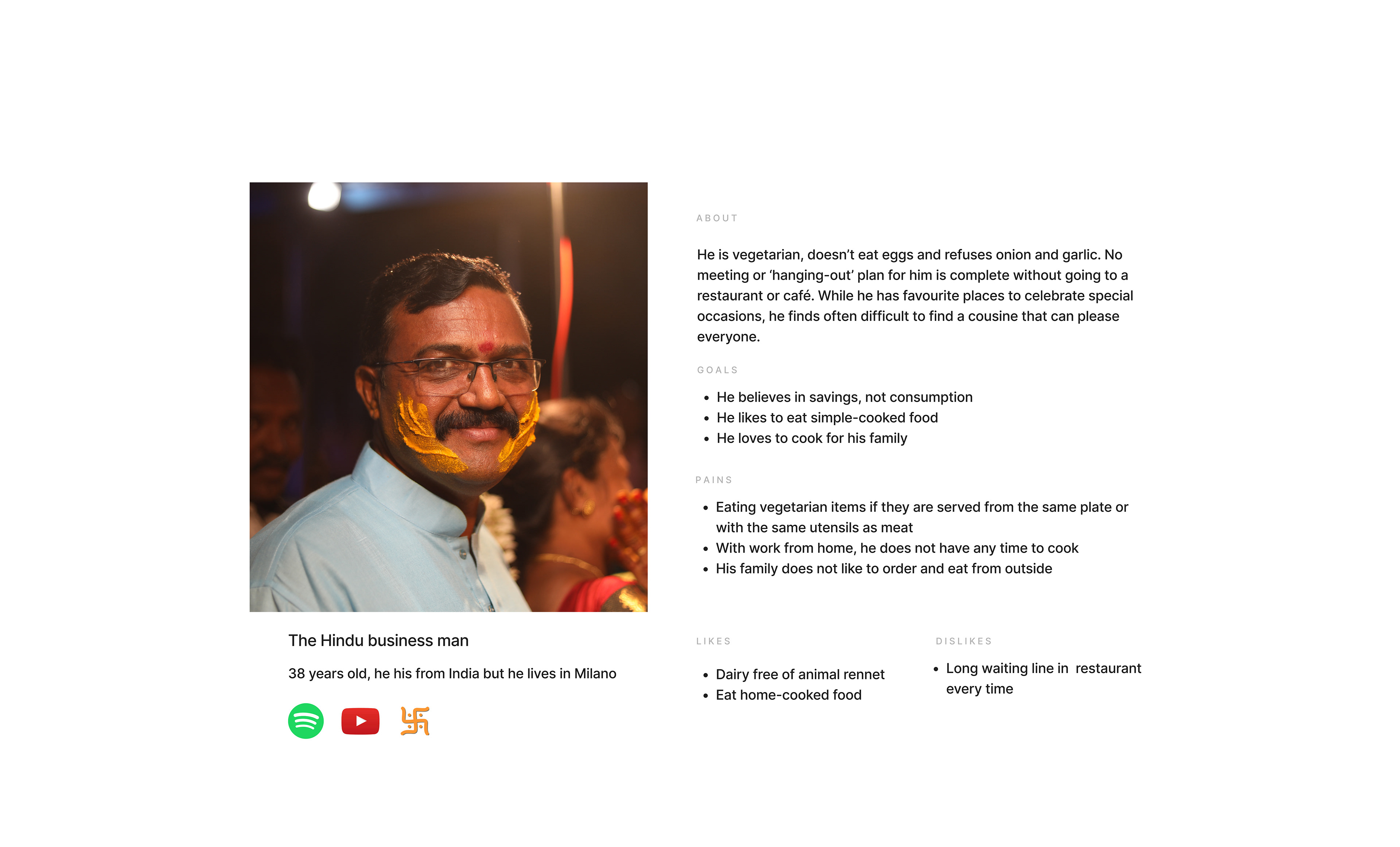
Akash is a Hindu business man, 38 years old and lives in Milano. He is vegetarian, doesn’t eat eggs and refuses onion and garlic. No meeting or ‘hanging-out’ plan for him is complete without going to a restaurant or café. While he has favourite places to celebrate special occasions, he finds often difficult to find a cousine that can please everyone.
Starting with our Personas Akash, we first selected the important elements that were relevant to the project :
- He is looking for home-cooked food.
- He has a specific diet (vegetarian) and hates certain common ingredients (onion & garlic).
- He is a business man who doesn't have time to cook lunch for his family.
- He has a family that is hard to please because they all have different tastes and are reluctant to order outside.
- He is careful with his expenses and does not like to waste.
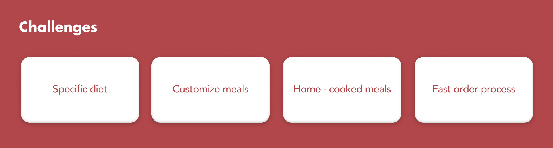
After that, we tried to define what the objectives of Akash could be when it comes to food delivery. We were aware that these objectives were based on our interpretation of our persona and therefore made of assumptions. We should have interviewed someone who matched the persona, but due to lack of time in the course, we didn't have the possibility to do it.
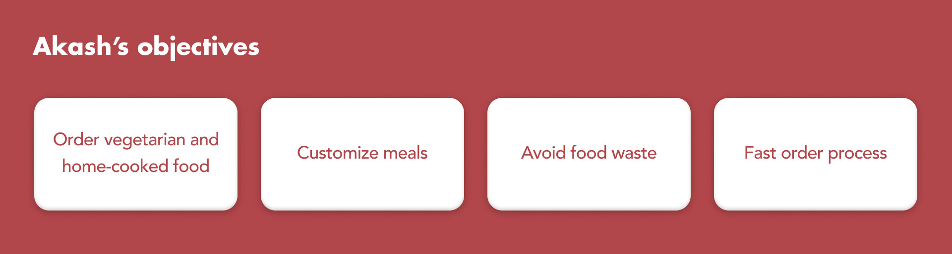
From the objectives, our solutions should focus on :
Offering the option to attract a vegetarian customer with particular dietary preferences, who avoids common ingredients.
Cater to the requirements of a time-pressed businessman who cannot cook for his family, yet desires to provide them with home-cooked meals.
Tackle the challenge of gratifying a family with varied preferences, who hesitates to order meals externally, while keeping the budget in mind and avoiding unnecessary waste.
The Problem
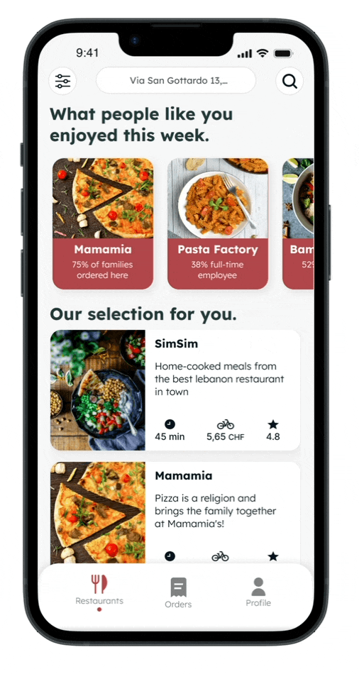
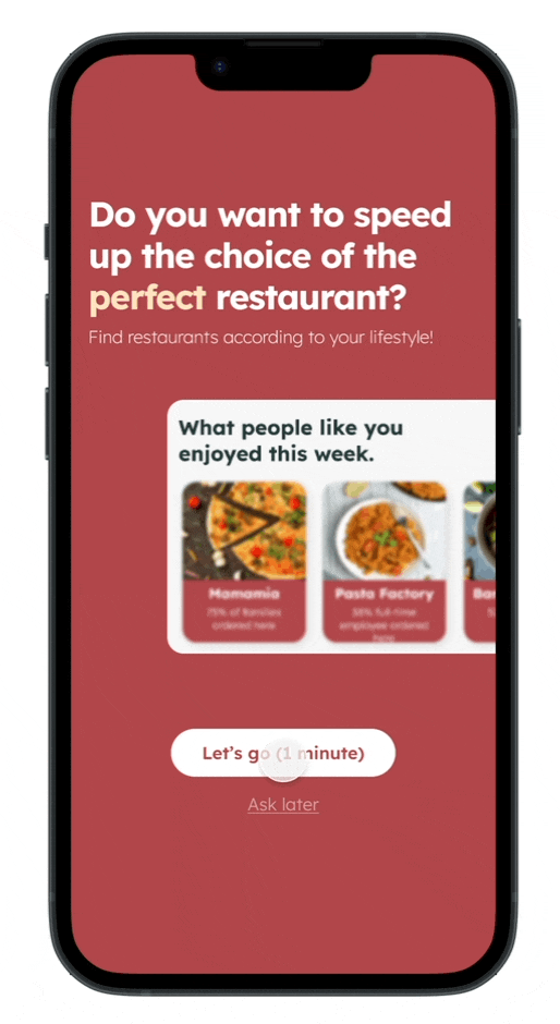
Based on our user research, we found that many food delivery apps on the market were overwhelming and confusing for users. The pain points that we wanted to address with Cherry App is how to make user centred approach and meet the needs. We spent a considerable amount of time working on the app's information architecture and navigation. We wanted to make sure that the app's structure was intuitive and that users could easily find what they were looking for. We believe that we were successful in creating a food delivery app prototype that is both intuitive and easy to use. With Cherry, users can easily browse their favourite menus, place group orders, and track their delivery status, all in one place.
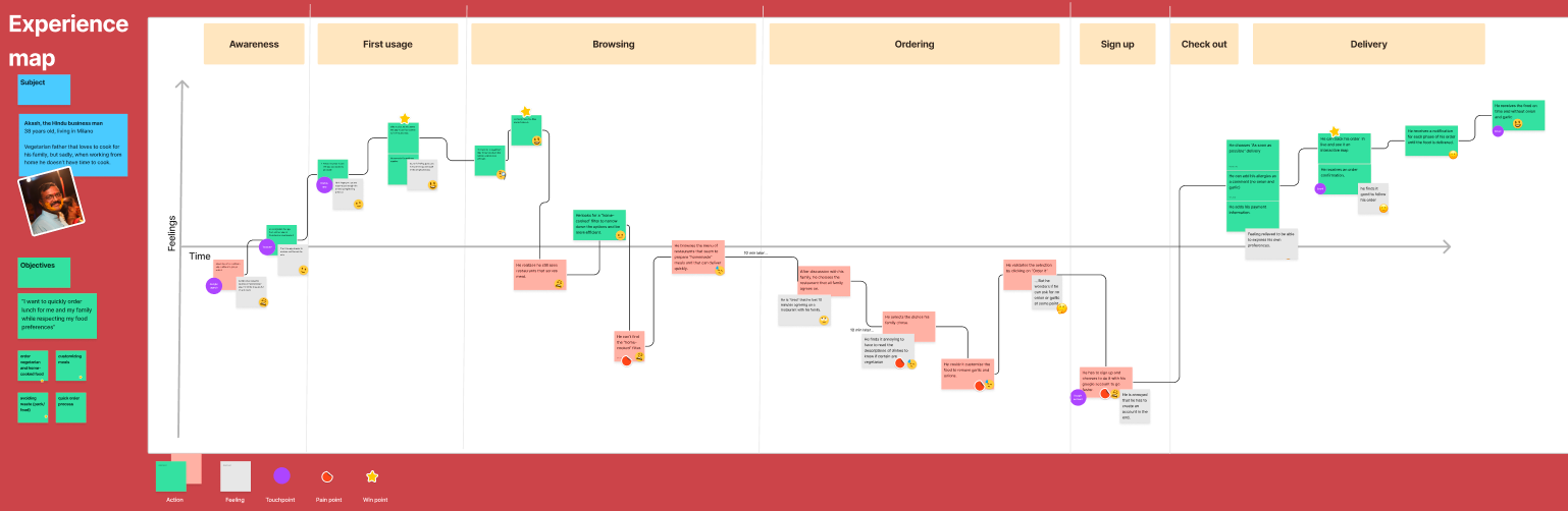
Experience map
After gaining a clearer understanding of Akash's requirements for food delivery, we worked on the experience map to define both pain and win points for better understanding the user’s need. Therefore, we mapped the experience through out each app from the other competitors, then we pooled our maps to create an overarching experience map that represented Akash's current experience with food delivery apps. We selected this approach because, given the limited time available in this phase, and we were not to carry out surveys or interviews.
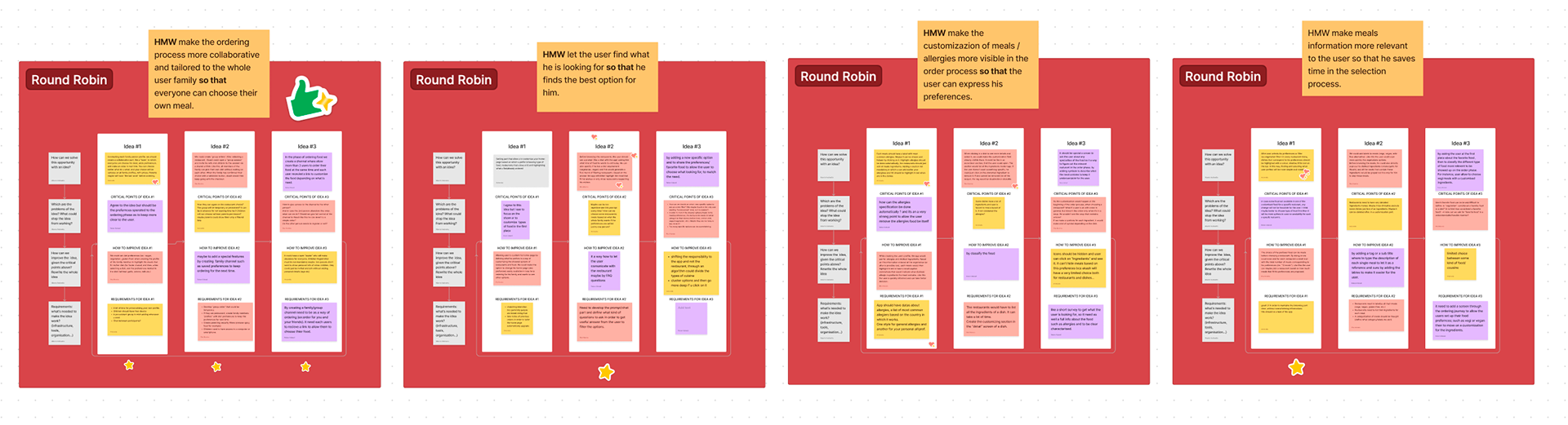
Ideation
Once we identified the key areas to target in our solution, we initiated the ideation phase by using a Round Robin approach for each HMW questions. We selected this methodology of process because it enabled us to delve deeper into each idea rather than generating many ideas without consideration, which would make the clustering process more complicated and time-consuming. In total, we performed five Round Robin sessions, which yielded three ideas for each HMW, resulting in a total of 15 ideas. We grouped similar ideas together and voted on which ideas to keep for further development.
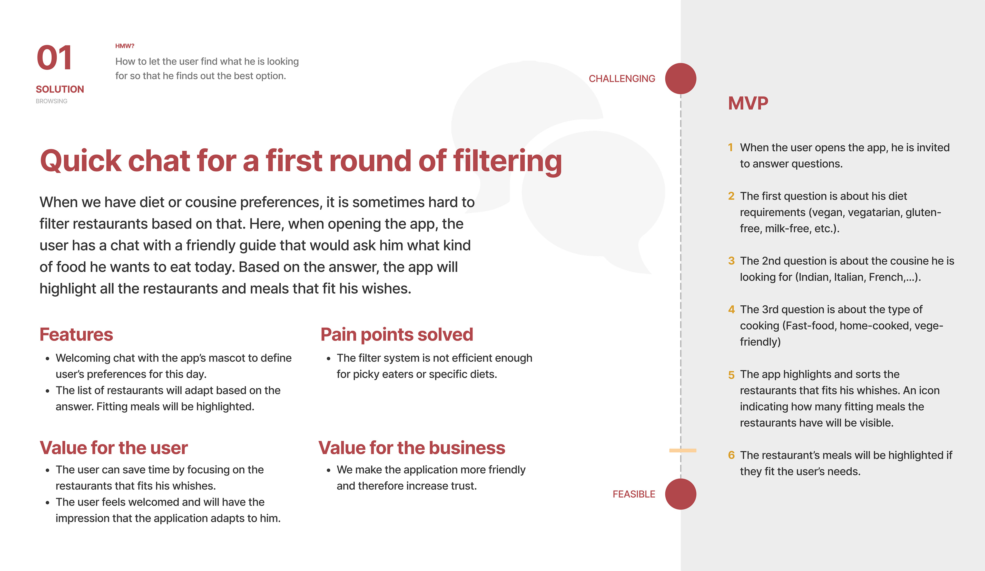
Solution cards & to-be map
All our voted ideas were then developed into solution cards so that it could be presented in a real context. For each solution card we have highlighted the advantages for the user but also for the company. We also used the card to propose a MVP defined by a user tasks list. This definition of the MVP saved us time in the design of the to-be experience map.
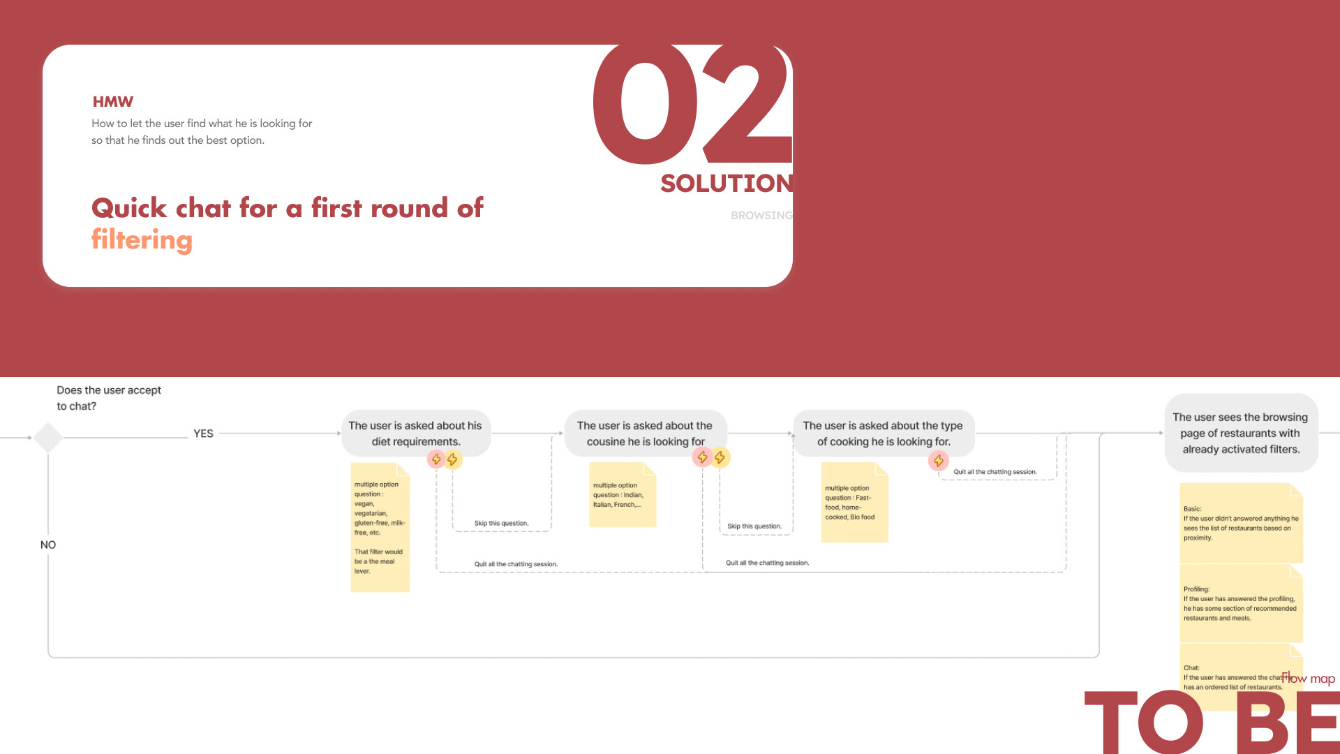
The to-be map helped us to better identify the precise moments when certain features should appear. It also allowed us to align our different visions into a common one across the team and it acted as a compass for the prototyping phase. With the to-be map, we also could think of alternative flows such as skipping questions or the whole chat.
Below is one example of the solution card we came up with along with an overview of its to-be experience map.
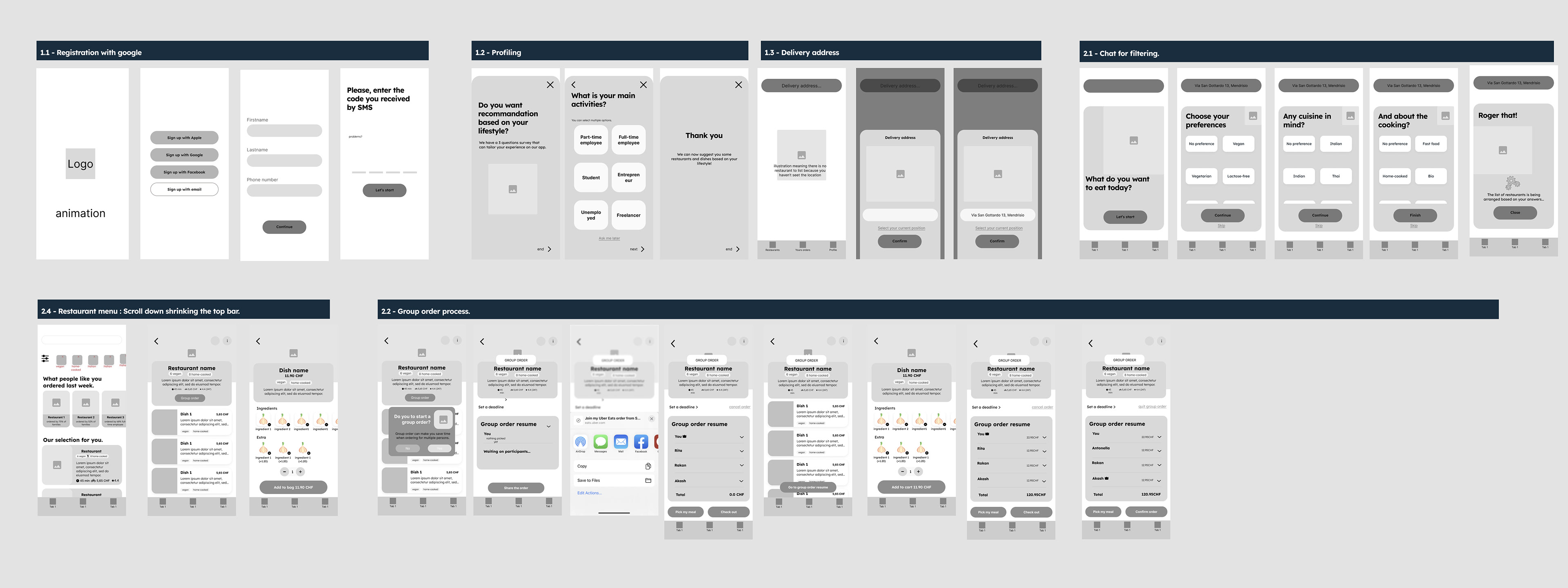
Wireframes
We started by creating lo-Fi wireframes to map out the structure and flow of the app. Then, we moved onto the design phase Hi-Fi, which involved creating a visual identity for the app, selecting colours rs and typography, and designing the interface.
User testings
When the prototype was ready, we were able to conduct quick user testing within the class. For that we came up with 4 user scenarios for the participants to perform. From this user testing, we discovered problems that we tried to transform into insights while considering Jakob's 10 Usability heuristics. We were able to implement some fixes. This short testing has allowed us to see that participants managed to navigate easily and intuitively throughout the prototype. The questions in the chat and survey seemed clear and the option to login as a guest was appreciated.
Identity & Style guide
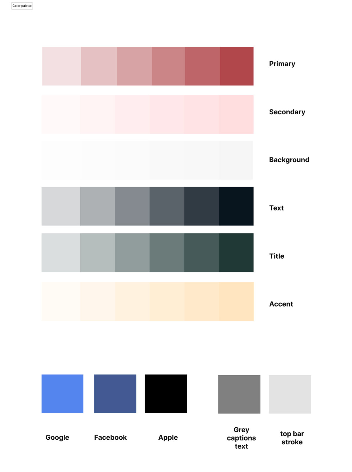
To define the app's identity, we first examined the meaning of colours ors commonly associated with food and dining. We discovered that red is typically associated with strong emotions, such as passion and excitement. We felt that this description suited Akash well: he is passionate about his work, his values, and spending time with his family and friends. Therefore, red was chosen as the primary colours. The rest of the colour palette was designed to be subdued, so as to emphasise the icons and product images.
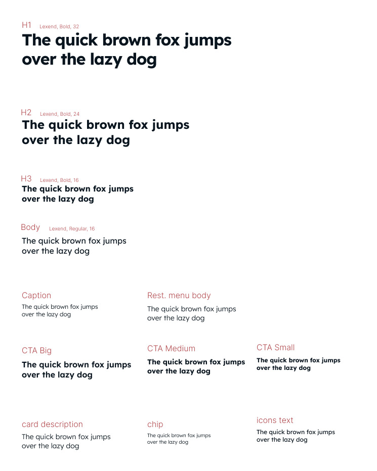
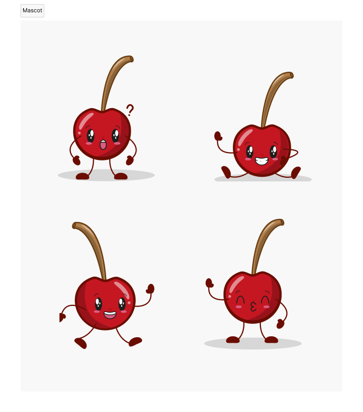
Next, we looked to red foods for inspiration for the logo, and decided on a cherry. The cherry symbolises luck and future happiness, both of which corresponded with our vision for the app as a new and enjoyable experience for Akash. To add a friendly touch, we created a cherry-shaped mascot to assist users in deciding what to eat. The mascot reflects the name of the application and the logo. Finally, we chose to use the clean and legible font, Lexend, which has been shown to significantly improve reading proficiency.

Pattern
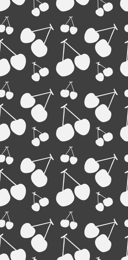
Pattern
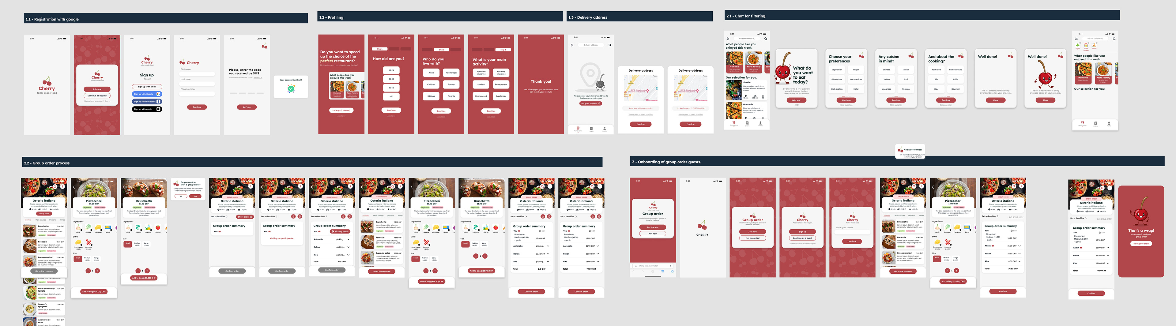
Prototype
After completing the initial design phase, we moved on to creating a high-fidelity prototype in Figma. The purpose of this prototype was to test the user experience and identify any areas that needed improvement. We wanted to ensure that the app was not only visually appealing but also user-friendly and intuitive.
During the testing phase, we carefully analyzed user feedback and made necessary adjustments to improve the app's overall functionality. We made sure that the app was designed to meet the specific needs of our target user, Akash, who is a Hindu businessman living in Milan, and has specific dietary requirements and preferences.
In the end, we are proud to say that we successfully created a sleek and user-friendly food delivery app that caters to the needs of Akash and users like him. We believe that our attention to detail and dedication to creating an intuitive user experience has resulted in an app that is both useful and enjoyable to use.

Final thoughts
Overall, this project would need more user testing and development. With the time constraints, we had to focus on a few phases of the ordering process which means that for example for the guest experience, we did not develop the screen that invites to register after paying for the order. And ultimately we preferred to focus on a few phases, but with careful thought, rather than designing several things that don't make much sense together.
The functionality of making group orders could be further developed by including a chat or voting system for shared appetizers or drinks for example. We also think that Cherry should be a web app available on desktop to make it accessible to invited group users who don't have the app.
Beyond all that, this project was a real opportunity to go through the different stages of design thinking in a team environment with all that it includes: the different agendas, experiences and opinions. The mentorship and use cases that Sketchin shared with us throughout the process were very inspiring. I think one of the great strengths of our prototype is that it is consistent and smooth thanks to the constant teamwork and reflection.
Feedback
“The presentation was one of the best of the class, the structure was clear and easy to understand. Experience map layout was efficient and the succession of: pain points, opportunities and HMW was great. Along with this section we really appreciated the solution cards slides. Including the to be flow and screen prototype made it the best of the day”.
Sarah Corti - Chief Design Officer -Sketchin